Loading...

Blog

Finally: SharePoint pages that don’t look like SharePoint

Kenny Crow
Kenny Crow
7th August 2025

If you’ve ever tried to make a SharePoint site look good and stay on brand, you’ll know it hasn’t always been easy. Until recently, even simple layout improvements or visual tweaks often meant using workarounds or bringing in a developer.

That’s changing.

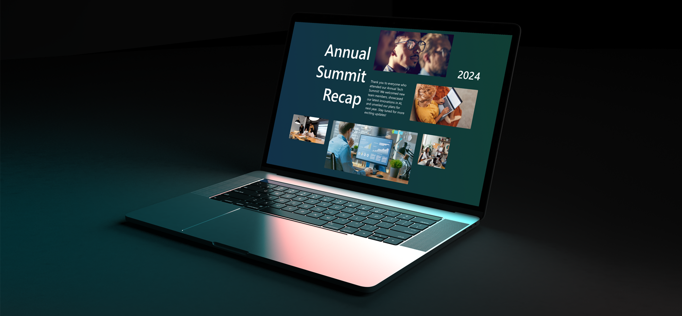
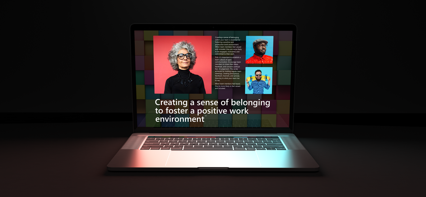
With the release of flexible layouts and Brand Center, Microsoft has made it possible to design SharePoint pages that feel more like modern websites. We’re already using these features to build full pages and entire intranet sites for our clients, all within the Microsoft 365 ecosystem.

Here’s what’s new and why it matters.

Flexible layouts: more creative control, better results

Flexible sections give us far more control over how pages are structured. Instead of being locked into rigid columns, we can now design on a two-dimensional grid that allows for:

  • Freer placement of content
  • Custom sizing and grouping of web parts
  • Visual patterns like hero banners, content grids and callouts
  • Responsive behaviour across desktop, mobile and email

It means we can create pages that feel more thoughtful and more engaging, while still being easy to maintain.

Brand Center: consistency, baked in

Brand Center is where your organisation’s fonts and colours are defined and managed centrally. Once set up, these assets flow through SharePoint’s standard design tools, ensuring consistency across everything we build.

We handle the full setup, including:

  • Uploading licensed fonts and defining how they’re used
  • Registering accessible colour palettes
  • Applying your brand settings across themes and templates
  • Making sure custom elements follow the same rules

It keeps things simple for you and consistent for your users.

What this means for you

With these new tools in place, we can design and deliver more flexible, better-branded SharePoint sites, faster. You get:

  • Pages that look more modern and more you, without relying on heavy custom code
  • Faster delivery and easier updates, thanks to more native design features
  • A more consistent and on-brand experience across your intranet
  • Clearer visual storytelling, stronger hierarchy and better user engagement

If you’d like to see how this could work for your organisation, get in touch. We can show you a short demo using your brand assets and give you a feel for how SharePoint can look when it’s done well.

Just drop us a message and we’ll take it from there.


Back to articles
Getting to know Nick: Our motion designer
BLOG POST 18/09/2025

Getting to know Nick: Our motion designer

By Article Ten - Team
Creative and curious, a film photography enthusiast and record collector who loves gaming, sketching, and chilling with his cats - meet our Motion Designer, Nick!
Why your brand needs to communicate sustainability – and how we can help
BLOG POST 22/05/2025

Why your brand needs to communicate sustainability – and how we can help

By Paul Maraviglia - Commercial Director
Here’s the real challenge: it’s not enough to be sustainable. Your brand needs to show it - clearly, creatively, and credibly.
office meeting

Ready for comms your audience will love?

Get in touch to learn how we can create something brilliant together.